We’ve all been there – staring at a blank canvas wondering how to create the perfect BBQ poster that’ll make mouths water and crowds gather. Whether you’re promoting a backyard bash or a professional smokehouse event your poster design can make or break your turnout.
Great BBQ poster design goes beyond just slapping some flames and meat photos together. It’s about capturing that smoky irresistible atmosphere that makes people crave perfectly grilled ribs and tender brisket. The right combination of colors typography and imagery can transform a simple announcement into a powerful marketing tool that drives real results.
We’ll explore proven design strategies that successful pitmasters and event organizers use to create posters that stand out from the competition. From choosing the perfect color palette to selecting mouth-watering visuals these ideas will help you create promotional materials that get people talking and most importantly showing up hungry.
Classic BBQ Poster Design Ideas With Vintage Appeal
Vintage BBQ poster designs tap into nostalgia while conveying the authentic, time-honored traditions of barbecue cooking. These classic approaches create an emotional connection with viewers who appreciate the heritage and craftsmanship behind great BBQ.
Retro Color Schemes and Typography
Earth tones form the foundation of classic BBQ poster color palettes, with burnt orange, deep red, and rustic brown creating warmth and appetite appeal. We recommend using cream or off-white backgrounds to provide contrast while maintaining that aged aesthetic that speaks to traditional BBQ culture.
Bold serif fonts like Rockwell or slab serif typefaces deliver the sturdy, masculine feel that resonates with BBQ audiences. Script fonts work beautifully for restaurant names or event titles, especially when they mimic hand-painted signage from classic roadside joints. Consider pairing a decorative headline font with clean, readable body text to ensure your message stays clear while maintaining visual interest.
Western-inspired typography adds authentic flavor to your vintage BBQ designs. Fonts that evoke old saloon signs or cattle ranch branding create immediate associations with outdoor cooking and hearty meals. These typefaces work particularly well for BBQ competitions and festival promotions.
Weathered Textures and Distressed Elements
Grunge textures transform modern designs into authentic-looking vintage pieces that appear weathered by time and smoke. We layer these textures over solid colors to create the appearance of aged wood, worn metal, or faded paint that you’d find on classic BBQ joints.
Torn paper edges and ink splatters add visual interest while reinforcing the rustic, hands-on nature of barbecue cooking. These elements suggest the messy, delicious reality of BBQ preparation and consumption. Apply these effects sparingly to avoid overwhelming your core message.
Scratched surfaces and rust effects work especially well on poster backgrounds or as overlays on text elements. These distressed treatments make your design appear as though it’s been hanging in a smokehouse for decades, building credibility and authenticity with your target audience.
Vintage BBQ Equipment Illustrations
Hand-drawn illustrations of classic smokers, grills, and BBQ tools create focal points that immediately communicate your poster’s purpose. We favor detailed line drawings of offset smokers, kettle grills, and traditional pit setups that showcase the craftsmanship behind great barbecue equipment.
Vintage utensil collections featuring tongs, meat forks, and basting brushes arranged in decorative patterns add visual appeal while filling negative space. These illustrations work well as border elements or corner decorations that frame your main content without competing for attention.
Classic BBQ imagery like cow silhouettes, pig illustrations, and chicken graphics provide instant recognition while maintaining that nostalgic feel. Combine these with vintage ribbon banners or decorative frames to create cohesive designs that honor barbecue traditions while promoting your exact event or establishment.
Modern Minimalist BBQ Poster Design Concepts

Modern minimalist design offers a refreshing contrast to traditional BBQ aesthetics, focusing on simplicity and visual impact. These contemporary approaches help your BBQ event stand out in today’s crowded promotional industry.
Clean Typography and Bold Colors
We recommend using clean, sans-serif typography paired with bold, vibrant colors to create maximum visual impact. This approach grabs attention instantly while maintaining clarity and readability across all viewing distances. Bold colors like bright reds, oranges, or yellows evoke warmth and the essence of grilling fire, making your poster visually captivating without cluttering the design space.
Typography choices should prioritize legibility over decorative elements. Sans-serif fonts like Helvetica, Arial, or custom modern typefaces work exceptionally well for event information. Color combinations that feature high contrast between text and background ensure your message reaches viewers effectively, whether they’re viewing your poster from across the street or up close.
Simple Geometric Shapes and Icons
Minimalist BBQ posters benefit from incorporating basic geometric shapes such as circles, rectangles, and clean lines alongside simple iconography. These design elements act as visual signifiers that communicate the BBQ theme effectively while keeping the overall aesthetic streamlined and contemporary. Icons like stylized grill flames, simplified utensils, geometric meat cuts, or abstract skewers work particularly well.
Geometric shapes serve dual purposes in minimalist design by organizing information hierarchically and creating visual interest without complexity. Circles can frame important details like dates or locations, while rectangular elements help structure text blocks. Simple icons should be reduced to their most essential forms, removing unnecessary details that might distract from the core message.
White Space Utilization
Generous use of white space creates breathing room around text and graphic elements, improving focus on key information like event names, dates, and locations. This strategic placement prevents overwhelming viewers while lending a clean, modern aesthetic that aligns perfectly with minimalist design principles. White space doesn’t necessarily need to be white; any neutral background color can serve this function effectively.
Proper white space distribution guides the viewer’s eye through your poster in a logical sequence. We structure our layouts to ensure primary information receives the most prominent placement, with supporting details arranged in order of importance. This hierarchy becomes more apparent and effective when surrounded by adequate negative space, making your BBQ event details instantly scannable and memorable.
Rustic and Western-Themed BBQ Poster Designs

We’ve found that rustic and Western-themed BBQ posters create an authentic outdoor atmosphere that perfectly captures the traditional spirit of barbecue culture. These designs transport viewers to the frontier with their warm, countryside aesthetic.
Wood Grain Backgrounds and Natural Textures
Wood grain backgrounds serve as the foundation for creating authentic rustic BBQ posters that resonate with outdoor cooking enthusiasts. These natural textures add depth and warmth to your design while establishing an immediate connection to the countryside ranch life aesthetic. We recommend incorporating weathered wood patterns or barnwood textures that enhance the tactile quality of your poster.
Natural textures create visual engagement by making viewers feel they can almost touch the surface of your promotional material. Textured backgrounds work exceptionally well because they evoke the cozy, grounded experience that BBQ event attendees are seeking. Using wood grain patterns instantly communicates the outdoor, traditional cooking environment that defines great barbecue.
Cowboy and Ranch-Inspired Graphics
Cowboy graphics transform ordinary BBQ posters into compelling Western-themed promotional pieces that capture attention immediately. Popular motifs include cowboy hats, boots, horseshoes, cattle skulls, and rustic fences that instantly evoke the frontier spirit. We’ve observed that these elements work particularly well when targeting audiences who appreciate Western heritage and traditional BBQ culture.
Ranch-inspired illustrations should be bold yet simple to maintain readability while reinforcing your thematic message. Vintage Western styles combine these graphics with traditional fonts to create authentic designs that honor the cowboy tradition. Adobe Stock and FreeVector provide extensive collections of Western BBQ graphic elements that can enhance your poster designs with professional quality vintage flair.
Earthy Color Palettes
Earthy color schemes form the backbone of successful rustic BBQ poster designs by creating warm, inviting atmospheres that draw viewers in. We recommend using deep browns, burnt oranges, muted reds, tans, and shades of beige and cream to complement wood textures and Western graphics. These warm tones set a casual mood that’s perfect for backyard BBQs, country fairs, or themed party events.
Color combinations should enhance your natural texture backgrounds while maintaining visual harmony throughout your design. Burnt orange and deep red work exceptionally well as accent colors against neutral brown and tan backgrounds. These palettes help communicate the cozy, authentic experience that BBQ enthusiasts expect from rustic-themed events.
Typography-Focused BBQ Poster Design Ideas

Typography serves as the backbone of effective BBQ poster design, transforming simple text into powerful visual elements that capture attention and communicate your event’s personality. We’ll explore strategic typography approaches that make your BBQ posters impossible to ignore.
Hand-Lettered Script Fonts
Hand-lettered script fonts inject personality and warmth into your BBQ poster design, creating an authentic connection with viewers. These fonts mirror the handcrafted nature of traditional barbecue, offering a personal touch that resonates with your audience’s desire for genuine experiences.
Chalkboard-style lettering works exceptionally well for titles like “BBQ Night” or “Grill & Chill,” evoking the casual atmosphere of neighborhood barbecue joints. We recommend using these fonts for headlines and featured phrases to establish an inviting, approachable tone.
Rustic signage styles complement outdoor cooking themes perfectly, mimicking the weathered signs found at authentic smokehouses. These fonts excel when paired with warm color palettes and natural textures, creating cohesive designs that feel both nostalgic and welcoming.
Custom script variations allow you to tailor your typography to match your exact event’s character. Consider incorporating subtle flame-like flourishes or smoky curves into your lettering to reinforce the barbecue theme while maintaining readability.
Bold Sans-Serif Headlines
Bold sans-serif fonts deliver maximum impact and ensure your BBQ poster remains readable from considerable distances. These typefaces communicate professionalism while maintaining the accessible nature essential for community events and casual gatherings.
High-contrast headlines using bold sans-serif fonts work particularly well for event names, dates, and special offers. We’ve found that fonts like Impact or Bebas Neue create commanding presence without overwhelming complementary design elements.
Layered typography approaches combine bold sans-serif headlines with lighter body text to establish clear visual hierarchy. This technique guides viewers’ eyes naturally from the main message to supporting details like location and time information.
Modern weight variations within the same font family allow you to create emphasis without introducing conflicting typefaces. Using extra-bold weights for primary information and regular weights for secondary details maintains consistency while providing necessary contrast.
Creative Text Layouts and Arrangements
Creative text arrangements transform standard poster layouts into ever-changing visual experiences that mirror the energy and movement of barbecue cooking. These innovative approaches help your poster stand out while reinforcing thematic elements.
Curved text alignments follow the natural flow of smoke trails or flame patterns, creating organic integration between typography and imagery. We recommend positioning curved text around grills, food images, or decorative elements to achieve seamless visual flow.
Diagonal text placement adds energy and movement to your design, breaking away from traditional horizontal layouts that can appear static. This technique works especially well for phrases like “Sizzling Specials” or “Fire It Up” that benefit from ever-changing presentation.
Layered text effects create depth and visual interest by overlapping different text elements at varying opacities. Consider placing translucent text behind solid headlines or using knockout effects to integrate typography with background imagery.
Flame-inspired arrangements position text to mimic the upward movement of fire, with letters gradually increasing in size or intensity. This approach works particularly well for restaurant names or event titles, creating memorable visual metaphors that reinforce your BBQ theme.
Illustrative BBQ Poster Design Approaches

Creative illustrations bring personality and warmth to BBQ posters that text alone can’t achieve. These artistic elements transform ordinary promotional materials into memorable visual experiences that connect with audiences on an emotional level.
Hand-Drawn Food Illustrations
Hand-drawn food illustrations add an authentic, personal touch that instantly communicates the artisanal nature of quality barbecue. We recommend incorporating classic BBQ favorites like ribs, burgers, sausages, corn on the cob, and skewers to showcase the delicious variety your event offers. These illustrations work beautifully as colorful centerpieces or simple line drawings, depending on your brand’s personality and target audience.
Rustic sketches create a casual, approachable atmosphere that makes viewers feel welcome before they even arrive. Digital and print applications both benefit from this versatile approach, especially when paired with vintage typography or bold fonts that enhance the overall visual impact. Hand-drawn elements establish credibility by suggesting the care and attention that goes into both the artwork and the actual food preparation.
Cartoon Character Mascots
Cartoon mascots transform BBQ posters into captivating, memorable promotional tools that stand out in crowded advertising spaces. Playful characters like smiling chefs, grill mascots, or anthropomorphized food items with friendly faces create instant emotional connections with viewers. These characters become brand ambassadors that people remember long after seeing your poster.
Family-friendly events particularly benefit from mascot designs because they signal a welcoming environment for all ages. Characters holding BBQ tools like spatulas, forks, or tongs directly reinforce the barbecue theme while adding personality to your message. Social media promotion and event flyers gain important engagement when featuring approachable, lighthearted mascot designs that encourage sharing and interaction.
Detailed Grill and Smoker Artwork
Detailed grill and smoker illustrations communicate craftsmanship and quality that serious BBQ enthusiasts immediately recognize and respect. These realistic artwork pieces showcase the equipment that creates exceptional barbecue, appealing to audiences who appreciate the technical aspects of smoking and grilling. Visual elements like smoke wisps, glowing flames, and textured surfaces evoke the warmth and delicious aromas that define great BBQ experiences.
Sophisticated poster designs benefit from this approach because detailed equipment artwork conveys expertise and authenticity. We suggest pairing these illustrations with elegant or bold typography that matches the quality level your artwork suggests. Professional BBQ competitions, upscale smokehouse promotions, and create barbecue events gain credibility through detailed equipment imagery that speaks to knowledgeable audiences.
Photo-Based BBQ Poster Design Strategies

Photography transforms BBQ posters from simple announcements into irresistible invitations that capture the authentic essence of barbecue culture. Strategic use of compelling images creates immediate visual impact and connects with viewers on an emotional level.
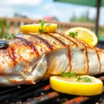
Mouth-Watering Food Photography
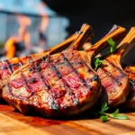
Close-up shots of BBQ dishes showcase the textures that make mouths water instantly. Glistening sauces catching light create appetizing reflections that draw viewers in. Char marks on perfectly grilled meat tell the story of skillful cooking. Juicy meat cuts reveal the quality that awaits guests at your event.
Signature BBQ items deserve spotlight treatment in your poster design. Ribs stacked high demonstrate abundance and value. Brisket slices showing perfect smoke rings communicate expertise. Pulled pork piled on rustic buns suggests comfort and satisfaction. Grilled vegetables add color variety and appeal to diverse dietary preferences.
Good lighting emphasizes the richness and color that makes BBQ so appealing. Natural daylight brings out authentic meat tones. Warm artificial lighting creates cozy atmosphere. Strategic shadows add depth and dimension to food photography. Backlighting through steam or smoke creates dramatic visual effects.
Styled platters and rustic serving boards enhance the BBQ atmosphere you’re promoting. Wooden cutting boards suggest traditional preparation methods. Cast iron skillets communicate authentic cooking techniques. Mason jars filled with sauces add homestyle charm. Checkered napkins and butcher paper create classic BBQ presentation.
Action Shots of Grilling Process
Flames and smoke capture the excitement of live BBQ cooking. Dancing flames create movement and energy in static poster designs. Rising smoke suggests the aromatic experience awaiting guests. Sizzling meat on hot grates communicates freshness and quality. Steam rising from perfectly cooked food adds sensory appeal.
Hands working with grilling tools show the craftsmanship behind great BBQ. Tongs turning meat demonstrate active cooking processes. Brushes applying sauce reveal attention to flavor details. Gloved hands managing hot equipment suggest safety and professionalism. Close-ups of seasoning application show care in preparation.
Ever-changing angles create movement and energy that grab viewer attention. Low angles make grills appear powerful and impressive. Side shots capture the full cooking process in action. Overhead views show the scale of food preparation. Diagonal compositions add visual interest and break up static layouts.
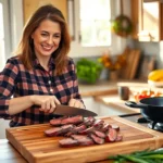
Chef and Pitmaster Portraits
People behind the BBQ create personal connections that build trust with potential guests. Experienced pitmasters convey expertise and reliability. Smiling chefs suggest friendly service and hospitality. Team photos show collaborative effort and dedication. Action portraits capture passion for the create.
Confident poses with tools and food demonstrate competence and pride. Chefs holding signature dishes showcase their best work. Pitmasters standing beside impressive smokers communicate scale and capability. Hands-on-hips poses suggest confidence in abilities. Crossed arms with aprons create approachable authority.
Warm tones in portrait photography evoke hospitality and expertise. Golden hour lighting creates flattering skin tones. Warm color filters enhance the cozy BBQ atmosphere. Natural expressions convey genuine passion for cooking. Eye contact with the camera creates personal connection with viewers.
Event-Specific BBQ Poster Design Ideas

Different BBQ events require customized design approaches that speak directly to their unique audiences and purposes.
Competition and Contest Themes
Ever-changing contest posters demand energetic design elements that capture the thrill of competition. Bold fonts and aggressive layouts immediately convey excitement and challenge to potential participants. Trophy icons, ribbons, and medal graphics establish the competitive atmosphere while drawing attention to prizes and recognition opportunities.
Action photography featuring grillmasters in competition mode adds authenticity to contest promotions. We recommend showcasing chefs wielding tongs over blazing grills or concentrating intensely on their create. These images create emotional connections with serious BBQ enthusiasts who understand the dedication required for competition.
Professional contest symbolism balances rustic BBQ elements to maintain credibility. Clean typography paired with traditional BBQ imagery like flames and smoke creates designs that feel both approachable and legitimate. Strategic placement of sponsor logos and official contest rules ensures participants can quickly access essential information.
Call-to-action elements encourage immediate registration and participation. Phrases like “Enter Now” or “Register Today” positioned prominently within the design create urgency and drive conversions from viewers to participants.
Festival and Community Gathering Designs
Community BBQ festivals require wide-format banners that celebrate togetherness and local culture. Vibrant festival colors like bright yellows, oranges, and reds create an atmosphere of celebration and joy. Large-scale designs accommodate multiple pieces of information while maintaining visual hierarchy and readability.
Diverse groups of people enjoying food together emphasize the inclusive nature of community events. We incorporate illustrations or photos showing families, friends, and neighbors sharing meals and conversations. These visuals communicate that everyone belongs at the festival regardless of age or background.
Local vendor logos and musical entertainment details transform posters into comprehensive event guides. Open-air tent illustrations, music note graphics, and family-friendly activity icons help attendees understand the full scope of entertainment available. This approach positions the BBQ as part of a larger community celebration.
Customizable template features on platforms like Canva and PosterMyWall allow organizers to adapt designs for exact communities. These tools enable quick updates for dates, locations, and local sponsor information without requiring professional design skills.
Restaurant Promotion Layouts
High-quality food photography takes center stage in restaurant BBQ poster designs. Close-up shots of perfectly glazed ribs, juicy brisket, and smoky pulled pork create immediate appetite appeal. Professional food styling ensures dishes look irresistible and premium quality.
Sophisticated typography and clean layouts reinforce brand identity and professionalism. Modern sans-serif fonts paired with strategic white space create designs that feel upscale and trustworthy. Brand colors and logo placement establish recognition and build customer loyalty.
Promotional offers like happy hour specials and seasonal menu items drive immediate action. Time-sensitive discounts and limited-time offers create urgency that converts viewers into customers. Clear pricing and offer details eliminate confusion and encourage quick decisions.
Restaurant contact information and location details receive prominent placement for easy customer access. Phone numbers, addresses, and social media handles positioned clearly ensure potential customers can easily find and connect with the business.
Color Psychology in BBQ Poster Design

Colors serve as powerful psychological triggers that directly influence appetite and behavior. Strategic color selection transforms ordinary BBQ posters into compelling invitations that make viewers crave smoky flavors.
Warm Reds and Oranges for Appetite Appeal
Red commands attention instantly while triggering physiological responses that stimulate hunger. This passionate color raises heart rates and creates urgency, making it perfect for BBQ promotional materials. Studies show red increases appetite more than any other color, explaining why successful restaurants and food brands rely on this powerful hue.
Orange blends red’s energy with yellow’s warmth to create an inviting atmosphere. We see this welcoming color combination work effectively because it suggests both excitement and friendliness. Together, warm reds and oranges grab viewer attention while creating genuine food cravings that enhance poster effectiveness at drawing customers to your event.
BBQ posters featuring these warm tones perform exceptionally well because they align with the natural colors of grilled meats and flames. Incorporating gradient effects from deep burgundy to bright orange can simulate the visual appeal of perfectly cooked barbecue.
Earthy Browns and Blacks for Authenticity
Browns evoke natural, grounded feelings that perfectly match BBQ’s rustic heritage. These earthy tones suggest craftsmanship and quality while reinforcing the genuine, homemade atmosphere that BBQ enthusiasts seek. Rich chocolate and coffee browns create sophisticated backgrounds that allow other design elements to shine.
Blacks add essential contrast while lending authenticity to your visual message. Deep charcoal and matte black tones enhance readability by creating clear distinction between text and background elements. We recommend using black strategically for typography and accent elements rather than overwhelming the entire design.
Weathered browns paired with deep blacks communicate traditional smoking methods and time honored recipes. This combination appeals to consumers seeking authentic experiences over mass produced alternatives, making your BBQ event stand out from generic food promotions.
Complementary Color Combinations
Complementary colors create vibrant contrasts that make key information pop off the page. Pairing warm reds or oranges with cool greens or blues generates visual tension that guides viewers naturally through your poster’s hierarchy. We use these opposing colors to highlight special offers, event dates, or contact information without creating visual chaos.
Balanced contrasting palettes help establish clear navigation paths through your design. Strategic placement of complementary colors draws attention to calls to action while maintaining overall visual harmony. Color theory principles ensure your poster remains attractive rather than overwhelming to potential customers.
Advanced color combinations might include warm orange headlines against deep teal backgrounds or burgundy text over sage green accents. These sophisticated pairings create memorable visual experiences that distinguish your BBQ event from competitors while maintaining professional appeal.
Essential Design Elements for BBQ Posters

Creating compelling BBQ posters requires mastering exact visual components that instantly communicate the heat, flavor, and excitement of barbecue culture. We’ve identified three fundamental elements that transform ordinary promotional materials into irresistible invitations.
Fire and Smoke Visual Effects
Fire and smoke effects immediately evoke the essence of grilling and outdoor cooking in BBQ posters. These ever-changing visuals create a warm, inviting atmosphere that suggests the sizzling, smoky flavors viewers can expect. Stylized flames work particularly well when incorporated into backgrounds or borders, emphasizing the heat and cooking action that makes barbecue so appealing.
Smoke trails add movement and energy to poster designs while reinforcing the authentic cooking process. Glowing embers scattered throughout the composition create depth and visual interest without overwhelming the main content. We recommend using these effects strategically to frame important information like event details or food offerings, ensuring they enhance rather than distract from your message.
BBQ Tool and Equipment Icons
BBQ tool icons clearly communicate your poster’s theme while adding an authentic, hands-on feel to the design. Popular equipment illustrations include grills, tongs, spatulas, forks, and cooking paddles that immediately signal barbecue expertise. These visual elements work especially well when arranged around text to create attractive framing that draws attention to key information.
Simple vector images of charcoal grills serve as powerful focal points that establish credibility and craftsmanship. Cooking utensils arranged in patterns or borders add rustic charm while maintaining clean, professional aesthetics. We’ve found that combining multiple tool icons creates comprehensive visual stories that speak to serious BBQ enthusiasts and casual grillers alike.
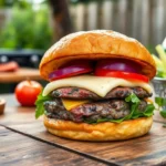
Appetizing Food Imagery
High-quality food images capture attention and stimulate appetite more effectively than any other design element. Close-up shots of ribs, burgers, sausages, and corn on the cob showcase the quality and variety of your BBQ offerings. Overhead photography works particularly well for displaying complete plates with garnishes and side dishes that tell the full story of your culinary experience.
Vibrant colors in food photography enhance visual appeal and convey freshness that makes viewers hungry. Well-cooked dishes with perfect grill marks and juicy textures create immediate emotional connections with potential guests. We recommend selecting images that highlight the exact foods you’ll be serving, ensuring authenticity and accuracy in your promotional materials.
Digital vs Print BBQ Poster Design Considerations

Understanding the technical differences between digital and print BBQ poster design helps us create promotional materials that perform optimally in their intended environments. Each format demands exact considerations to achieve maximum visual impact and effectiveness.
Resolution and File Format Requirements
Print BBQ posters require 300 dpi resolution or higher to ensure crisp, professional-quality output without pixelation. We recommend using CMYK color mode for print materials, as this matches commercial printing processes and prevents color shifts. Source files should be saved as PDF, TIFF, or high-resolution JPEG formats to maintain quality during the printing process.
Digital BBQ posters perform best at 72-150 dpi resolution, which provides sufficient clarity while keeping file sizes manageable for web use. RGB color mode delivers vibrant colors that display accurately on screens and devices. PNG and JPEG formats work well for social media and website applications due to their balance of quality and compression.
Maintaining editable source files in AI or PSD formats gives us flexibility to adapt designs for different uses without quality loss. These master files enable quick modifications for various platforms while preserving design integrity.
Social Media Optimization Tips
Format variations should include square (1:1), vertical (4:5 or 9:16), and industry (16:9) dimensions to accommodate different social media platforms. Instagram posts favor square formats, while Stories perform better with vertical orientations.
Typography choices must prioritize bold, legible fonts with high contrast against background images to ensure readability on small mobile screens. Text hierarchy becomes crucial when screen real estate is limited.
Content prioritization focuses on essential event information like name, date, time, and location while minimizing secondary details. Visual elements such as flames, grills, and appetizing food imagery capture attention in crowded social media feeds.
Template tools like Canva offer customizable BBQ poster templates specifically designed for social media sharing, streamlining the creation process for multiple platform formats.
Print Material and Finishing Options
Paper selection impacts the final appearance and durability of BBQ posters significantly. Glossy paper creates vibrant, shiny finishes that make food imagery pop, while matte paper provides elegant, non-reflective surfaces. Recycled paper options appeal to environmentally conscious audiences and events.
Protective finishes enhance both appearance and longevity of printed materials. UV coating adds extra protection and gloss, while lamination provides waterproofing and durability for outdoor displays. Spot gloss applications can highlight exact design elements like logos or event titles.
Premium effects such as embossed text or foil stamping create luxurious touches for upscale BBQ events and restaurant promotions. These special finishes command attention and communicate quality to potential attendees.
Size considerations typically range from standard 11″x17″ formats for indoor displays to larger custom dimensions for outdoor advertising, depending on viewing distance and location requirements.
Conclusion
Creating compelling BBQ poster designs requires balancing visual appeal with strategic communication. We’ve explored how combining traditional authenticity with modern design principles can transform simple promotional materials into powerful marketing tools that drive attendance and engagement.
The key lies in understanding your audience and event type while leveraging proven design elements like warm color palettes typography choices and mouth-watering imagery. Whether you’re promoting a backyard gathering or professional competition the right design approach will make your BBQ event impossible to ignore.
Remember that successful BBQ posters tell a story through visual elements that connect emotionally with viewers. By applying these design strategies and considering both digital and print requirements you’ll create promotional materials that not only look professional but also effectively communicate the irresistible appeal of your BBQ event.
Frequently Asked Questions
What makes an effective BBQ poster design?
An effective BBQ poster design combines thoughtful use of colors, typography, and imagery to capture the enticing atmosphere of barbecue. Key elements include warm color palettes (reds, oranges, browns), appropriate fonts that match your theme, mouth-watering food photography or illustrations, and clear event information. The design should evoke the authentic BBQ experience while ensuring readability and visual appeal.
What are the best colors to use for BBQ posters?
Warm colors work best for BBQ posters as they stimulate appetite and convey the heat of grilling. Use reds and oranges to command attention and create hunger appeal, earthy browns and blacks to evoke authenticity and craftsmanship, and burnt orange with deep red for retro themes. These colors create inviting atmospheres that resonate with BBQ culture.
Should I use vintage or modern design styles for my BBQ poster?
Both styles can be effective depending on your audience and event type. Vintage designs with weathered textures, distressed elements, and retro color schemes appeal to traditionalists and create nostalgia. Modern minimalist designs with clean typography and bold colors attract contemporary audiences. Consider your target demographic and event atmosphere when choosing between classic authenticity and modern sophistication.
What typography works best for BBQ poster designs?
Typography choice depends on your design theme. Hand-lettered script fonts create warmth and authenticity, while chalkboard-style lettering adds casual vibes. Bold sans-serif fonts ensure readability from distances and work well for headlines. For vintage themes, use bold serif fonts. Always prioritize readability while matching the font personality to your overall design aesthetic.
How important is food photography in BBQ poster design?
Food photography is crucial as it directly stimulates appetite and showcases quality. Use close-up shots that highlight textures, colors, and smoke. Action shots of grilling processes convey freshness and excitement. High-quality food images can transform posters into irresistible invitations. If photography isn’t available, detailed hand-drawn food illustrations can achieve similar appetizing effects.
What’s the difference between designing for print vs digital BBQ posters?
Print posters require 300 dpi resolution and CMYK color mode for quality reproduction, while digital versions need 72-150 dpi in RGB format. Digital posters should be optimized for various social media formats with larger fonts for mobile readability. Print allows for special finishes and premium materials, while digital offers easy sharing and cost-effective distribution.
How can I make my BBQ poster stand out from competitors?
Focus on unique visual storytelling that captures your event’s personality. Use creative typography layouts, incorporate authentic elements like hand-drawn illustrations or custom photography, and choose distinctive color combinations. Add personality through character mascots, showcase your specific BBQ specialties, and ensure your poster communicates what makes your event special compared to others.
What essential elements should every BBQ poster include?
Every BBQ poster should include clear event information (date, time, location), appetizing food imagery or illustrations, appropriate color scheme that evokes BBQ atmosphere, readable typography, and visual elements that communicate the BBQ theme (fire, smoke, grills, tools). Balance promotional content with visual appeal while ensuring all critical details are easily scannable.